
Best Video Ad Examples to Inspire Your Next Campaign in 2026
One of the biggest challenges with video ads today isn’t access to tools or formats. It’s coming up with fresh ideas fast enough. Ad fatigue sets in quickly. A video that might have run for a week not long ago can now burn out in a few days, sometimes even sooner.
That puts constant pressure on creative teams. You’re not just making one good ad. You’re expected to keep finding new angles, new hooks, and new ways to say the same thing without repeating yourself.
This article is meant to help with that. We’ve collected a set of video ad examples that use different approaches. For each example, we break down what the ad does well and what you can take away from it.
Quit Working Fridays (Mindvalley)
This ad is from Mindvalley, a personal development platform that sells online courses and memberships. The spot features founder Vishen Lakhiani speaking directly to the camera from what looks like his living room, with three bold words filling the screen: "QUIT WORKING FRIDAYS."
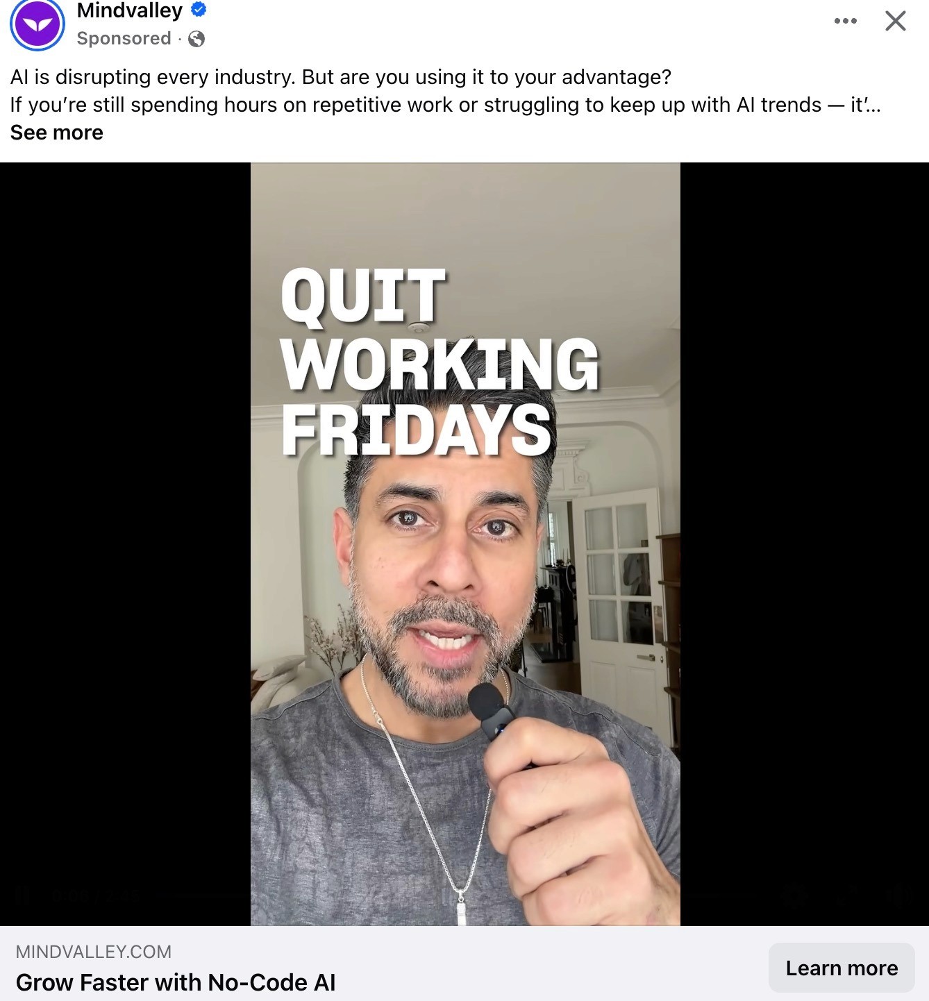
The ad copy above the video sets the context: AI is changing every industry, and if you're still grinding through repetitive tasks, you're falling behind. But the video itself doesn't explain any of that. It leads with a statement designed to make you stop and react. "Quit Working Fridays" feels confrontational, almost irresponsible, which is exactly why it works as a scroll-stopper. You want to know if this person is serious, and that curiosity is enough to earn the next few seconds.
There's no product walkthrough, no feature list, no testimonial. Vishen speaks with the authority of someone who runs a company and has actually made this change. The home setting and lavalier mic make it feel personal rather than produced, but the framing is clean enough to signal credibility. The ad sells a single, specific outcome (getting your Fridays back using AI) and pushes everything else to the landing page for Mindvalley's free AI Summit.
Takeaways for you:
A bold, contrarian statement as text overlay can do more work than any product demo in the first two seconds
Founder-led ads in a casual home setting build trust quickly, especially when the claim feels big
The ad doesn't try to explain the product. It sells the transformation (freedom from Friday work) and lets the landing page handle the rest
UGC-style ads from Magic Spoon
This ad is from Magic Spoon, a high-protein, low-carb cereal brand. The video features a woman talking to the camera from home, standing behind a full lineup of Magic Spoon boxes.
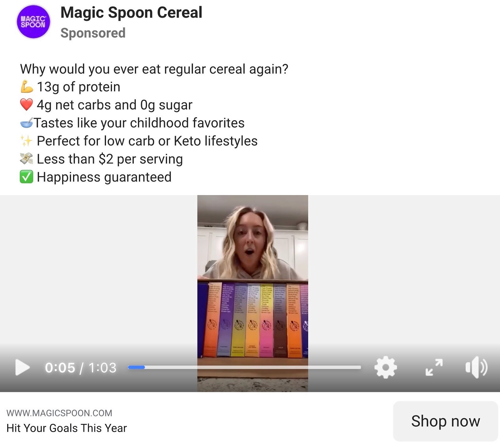
The visual setup is doing a lot of work here. Before the creator says a word, you see every flavor of Magic Spoon lined up side by side. It's a passive product demo that communicates range and variety without needing overlays, graphics, or a walkthrough. The creator speaks with genuine enthusiasm, reacting to the product the way someone would in a real conversation rather than reading from a script. It feels like a recommendation from a friend, not a paid placement.
The lo-fi production style actually works in the brand's favor because it mirrors how real people talk about products they like on social media. It blends into the feed rather than announcing itself as an ad, which lowers resistance and keeps viewers watching longer.
What's smart is how the product lineup behind the creator answers the "is there a flavor I'd like?" objection without anyone having to say it out loud.
Takeaways for you:
Placing the full product range in frame lets you show variety without narrating it. Viewers draw their own conclusions, which sticks better than a feature list.
Genuine enthusiasm from a creator is hard to fake and hard to beat. If the energy feels real, lo-fi production becomes an asset, not a limitation.
Simple, single-location UGC with no editing still performs well for DTC brands, especially when the product is visually distinctive enough to carry the frame on its own.
Your Forever People Platform (Deel)
This ad is from Deel, an HR and global payroll platform. Instead of showing the product, a dashboard, or a talking head explaining features, it shows a woman sitting peacefully in a lush garden surrounded by purple flowers, floating laptops, and a large white wing. The tagline reads: "deel. Your forever people platform."
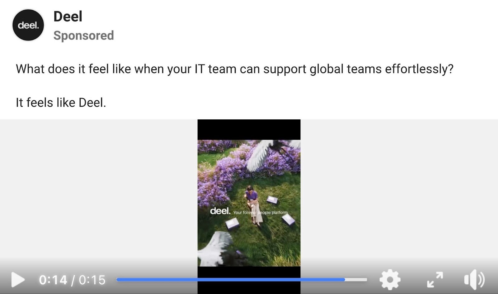
The entire ad sells a feeling, not a function. The question in the copy, "What does it feel like when your IT team can support global teams effortlessly?", sets up an emotional premise. The video answers it with a visual metaphor: calm, beauty, ease. No friction, no chaos, no Slack notifications. Just peace. It's the opposite of what managing global IT actually feels like, and that contrast is the point.
This is a bold move for a B2B brand. Most competitors in this space default to product UI walkthroughs or customer testimonials. Deel skips all of that and bets on brand recall instead. At 15 seconds, there's no time for explanation, so the ad doesn't try. It plants an association: Deel equals effortless. That's the entire job of the creative.
The elevated, almost cinematic visual style also makes this stand.
Takeaways for you:
B2B ads don't have to look like B2B ads. Selling a feeling instead of a feature can be more memorable, especially for brand awareness at the top of the funnel.
Ultra-short runtimes (15 seconds or less) force clarity. If you can only say one thing, make it emotional rather than functional.
Montessori Busy Board (Toddla)
This is an Instagram ad from Toddla, a DTC brand selling Montessori-style busy boards for toddlers. The video shows a creator holding up the product directly to the camera, showing off the design and walking through what's inside. It's shot in a kitchen, handheld, with no editing or production to speak of.
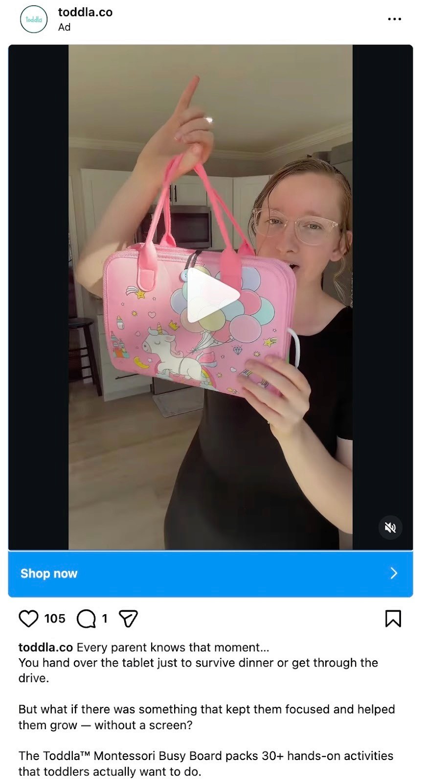
The ad works because it immediately qualifies its audience. If you're a parent who's handed a tablet to your kid just to get through dinner or a car ride, you already feel seen. That guilt is real and widespread, and the ad doesn't judge it. It just offers an alternative. The product is positioned as the thing that replaces screen time with something hands-on, which is exactly the trade-off this ICP is looking for.
The creator looks like a real mom showing something she found, not a spokesperson reading a brief. She holds the product up the way you'd show a friend something you just bought. That unpolished, first-person energy is what makes UGC effective for parenting products. Parents trust other parents, especially when the setting and delivery feel genuinely unscripted.
Takeaways for you:
Lead with a pain point your audience already feels guilty about. You don't need to create the problem; just name it and offer a better option.
For physical products with lots of detail, holding it up to the camera and walking through it beats any flat-lay or lifestyle shot.
Parenting and family products benefit from creators who look and sound like the target buyer. Authenticity matters more than production quality in this category.
The Shape Is the Story (Cartier)
This is an Instagram ad from Cartier's watch community account, promoting the Santos de Cartier. The video starts by layering three visual elements on screen simultaneously: an archival sketch of the original watch design, the modern product shot, and a vintage photograph of what appears to be an early aviation scene.

The ad doesn't sell you a watch. It sells you a story about why this watch exists. The Santos was originally designed for a pilot who needed to check the time without taking his hands off the controls, and that origin is what the entire creative is built around. By pairing the original sketch with the finished product and the historical context, Cartier turns a product ad into a short history lesson that makes the viewer feel like they're learning something rather than being sold to.
The visual style is elevated and editorial, closer to a magazine spread than a social ad. The layered collage of archival imagery, graph paper texture, and the product feels curated and deliberate. With 10.6K likes, it's clearly resonating. And it works because luxury buyers don't need to be convinced on function. They need to be convinced of the meaning. This ad gives the product a reason to exist beyond aesthetics.
This is an educational authority play wrapped in brand storytelling. The tactic works especially well for heritage brands that have genuine history to draw on, not manufactured origin stories.
Takeaways for you:
If your product has a real origin story, use it. History adds weight and meaning that no feature list can match.
Layering archival or historical visuals with modern product shots creates depth and makes the ad feel like content worth stopping for, not an interruption.
For premium or luxury categories, educate instead of sell. Giving the viewer something to learn earns more trust and engagement than a direct pitch.
Create Winning Video Ads With Airpost
Now that you’ve seen what’s possible, the next step is turning ideas into ads you can actually run. Inspiration is easy to find. Execution is where most teams slow down.
Airpost helps performance teams move from concept to live ads without adding more tools, more back-and-forth, or more creative bottlenecks.
It's a hybrid creative platform that pairs AI-powered production with experienced creative strategists who manage the strategy side for you. You don't prompt and hope. You get finished ads delivered weekly, built from a brief that your strategists refine based on real performance data.
With Airpost, teams can:
Receive 10-30 done-for-you video ads per week, ready to launch
Test genuinely different concepts across personas, hooks, and formats instead of running minor tweaks
Scale winners fast with automatic variation generation when an ad starts performing
Mix your own footage with Airpost's 300,000+ clip library and AI-generated video for ads that look real, not robotic
Behind every ad, Airpost's proprietary ad taxonomy tracks performance by format, hook type, angle, and creative pattern. You always know what's working, why it's working, and where to go next.
Book a demo with Airpost and get ready to launch ads, without compromising on speed or quality.


