Healthcare advertising is one of the hardest categories to get right. People are already anxious, overwhelmed, or skeptical, and most don’t want to be “sold” to when it comes to their health.
The best healthcare companies understand this. They don’t rely on shock, fear, or dramatic promises. Instead, they focus on clarity, reassurance, and small moments that feel real. Often, they explain just enough to build trust and let the viewer decide what to do next.
In this blog, we’ll look at 6 healthcare ad examples that build customer trust and can inspire your next campaign.
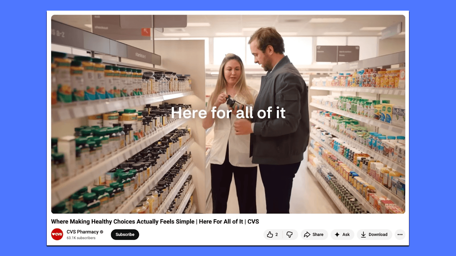
1. CVS - Healthy Choices
This ad focuses on a very real moment: walking into a pharmacy with good intentions and immediately feeling overwhelmed by the number of options.
Instead of pushing specific products or giving health advice, CVS positions itself as a place that helps make everyday wellness decisions feel simpler. The message centers on practicality that health choices don’t have to be perfect; they just need to fit into real life. It positions itself as a guide, not an authority.
The brand shows up as a place that helps narrow things down, reduce friction, and make choices feel more doable; empowering rather than instructional.
Takeaways for you:
Healthcare ads don’t need to prescribe behavior. By avoiding strict rules or ideal outcomes, the ad feels more approachable and relatable.
Reducing anxiety builds trust. Acknowledging confusion and choice overload makes the brand feel helpful instead of intimidating.
2. Bupa UK - No Normal Way to Grow Old
This Bupa UK ad is built around a simple idea: ageing doesn’t look the same for everyone, so care shouldn’t either. The campaign introduces the line “No Normal Way to Grow Old” and uses it to shift the conversation away from rigid definitions of elder care.
Instead of showing one version of aging, the ad highlights individuality, with different needs, personalities, routines, and levels of support.
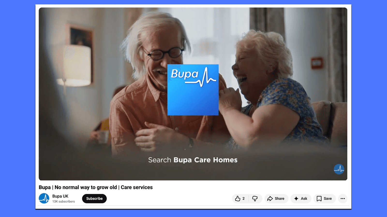
What stands out is the tone. The ad doesn’t rely on fear or decline to make its point. It’s calm and respectful, focusing on the role of trained carers who adapt their support to each person, whether that’s residential care, nursing, or dementia care. The message is reassuring without being overly emotional.
Bupa positions itself less as a service provider and more as a partner in later life. The campaign works because it avoids generalisations and acknowledges something people already know: there is no standard path to ageing. By centering care around the individual, the ad feels thoughtful, modern, and aligned with how people want healthcare brands to speak to them today.
Takeaways for you:
Challenge a rigid category assumption and replace it with a more human truth.
Show variation in people and needs instead of a single “typical” customer.
Avoid fear-based messaging when trust and reassurance matter more.
3. Walgreens Medicare - Support How You Need It
This Walgreens ad focuses on a very real moment: an older woman navigating a pharmacy visit with crutches. There’s no dramatic setup or heavy narration. It simply shows that getting basic healthcare support isn’t always easy, especially as mobility, energy, or confidence change with age.
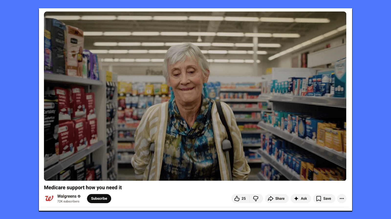
The message is clear and practical. Walgreens positions itself as a place that understands these everyday challenges and offers Medicare Rx support in a way that fits into people’s lives, when they need it, and how they need it. The ad doesn’t try to educate viewers on policy details or overwhelm them with information. Instead, it reassures them that help is available and accessible.
What works here is restraint. The story stays grounded in a single, relatable scenario rather than trying to represent every possible healthcare need. By doing that, the ad feels more human and believable.
Takeaways for you:
Healthcare ads can build trust by showing everyday friction, not idealized outcomes.
Clear, supportive messaging often lands better than detailed explanations in sensitive categories like Medicare.
4. Pfizer - Rural Mental Health Awareness
This Facebook ad from Pfizer doesn’t try to sell a product. Instead, it points attention to a problem that’s often overlooked: mental health in rural America. The opening lines deliberately challenge a common assumption that rural life is peaceful, simple, or idyllic, and then slowly introduce the reality of isolation, lack of access, and emotional strain that can come with it.
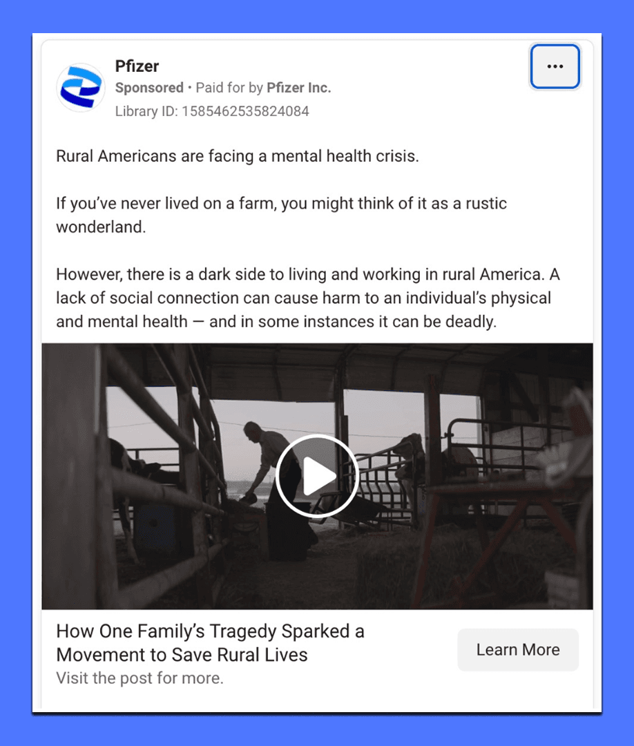
The creative choice here is restraint and context. The visuals stay grounded in everyday farm life. There’s no dramatic music or quick cuts. The copy does the work by naming the issue directly and explaining why it matters, without exaggeration. By leading viewers to a long-form article hosted by a credible publisher, the ad signals that this is about awareness and understanding, not instant action.
For a healthcare brand, this approach builds trust. Pfizer positions itself as a stakeholder in public health conversations, especially ones that don’t get enough attention. The ad respects the audience’s intelligence by offering depth instead of a slogan.
Takeaways for you:
Healthcare ads don’t always need a product hook to be effective; sometimes awareness itself is the goal.
Pairing simple visuals with thoughtful, educational copy can make serious topics feel accessible rather than overwhelming.
5. Panadol - Panaflex Cool Patch
This Panadol ad is built around a very specific use case: body pain that shows up when people are already in motion. Long flights, road trips, extended sitting, and travel fatigue. Instead of explaining pain in medical terms, the copy anchors itself in familiar situations and then introduces the product as something that helps you keep going.
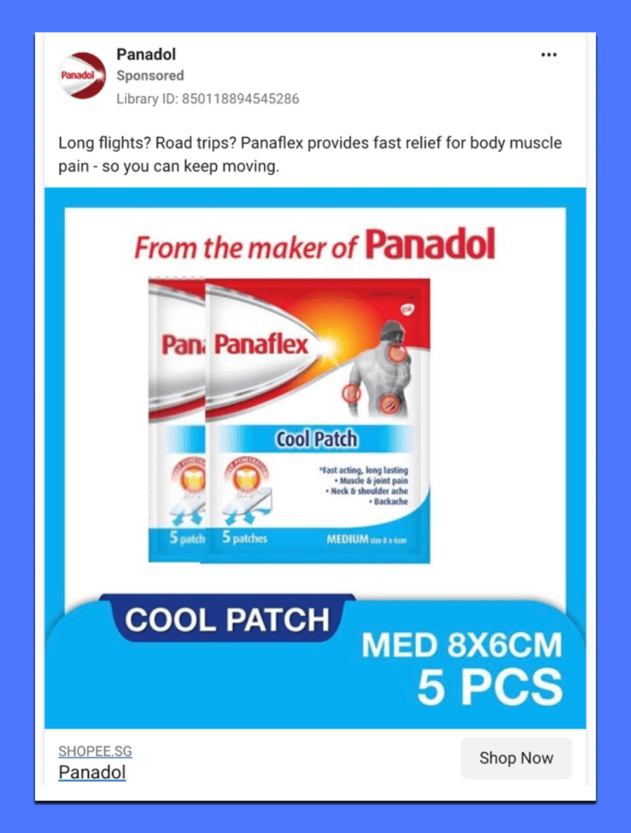
The visual does a lot of the practical work. The packaging is clear, the use areas are marked, and the benefit is spelled out directly. There’s no attempt to tell a story or create an emotional arc. The ad assumes the viewer already understands pain; it just focuses on what helps and when to use it.
This makes the message easy to scan and easy to remember. For an over-the-counter healthcare product, that clarity matters more than persuasion.
Takeaways for you:
Specific situations beat broad claims. Calling out moments like travel or long sitting makes the product feel immediately relevant.
Clear utility builds confidence. Showing how and where the product works reduces hesitation and speeds up decision-making.
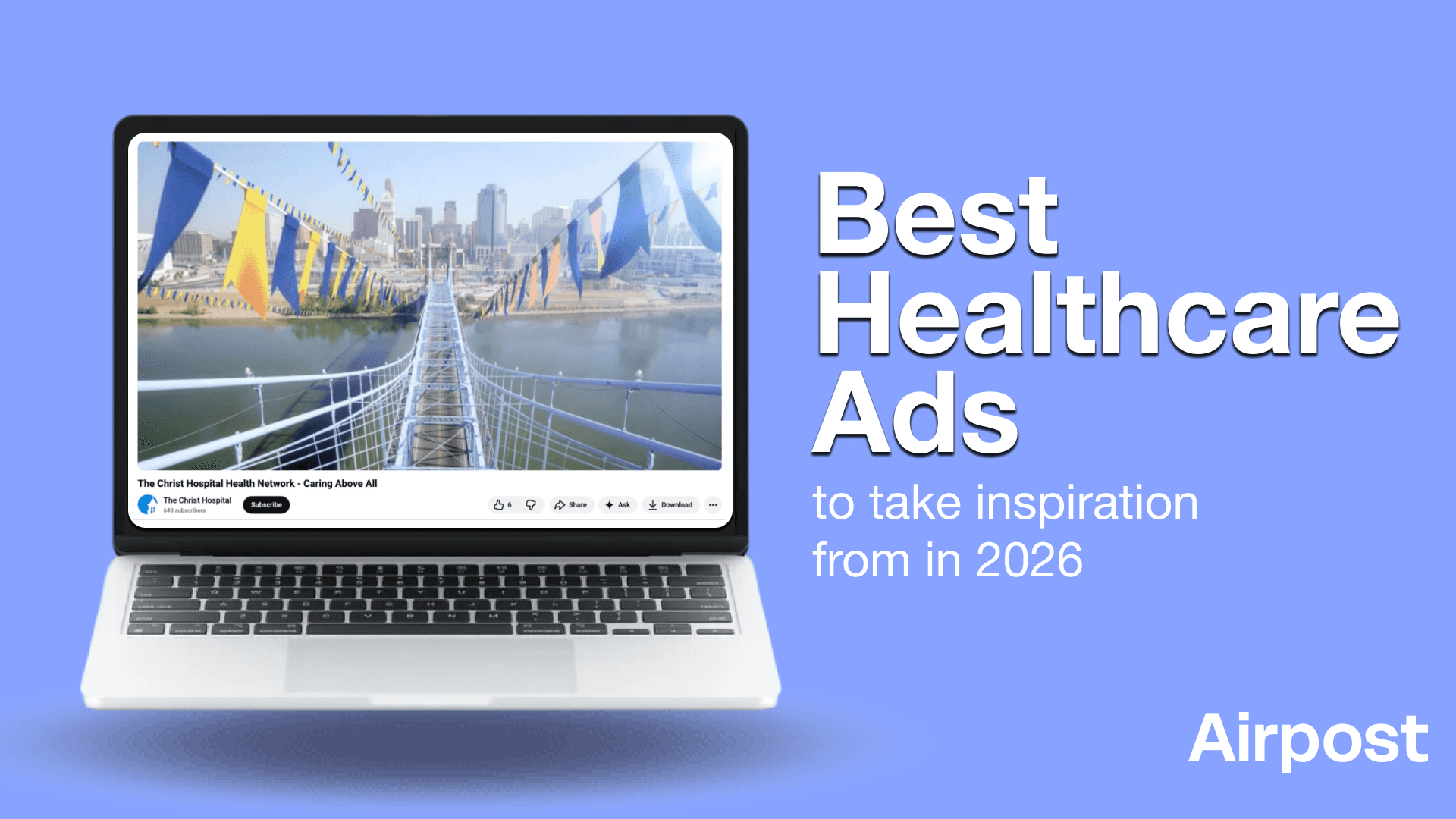
6. The Christ Hospital - Health Network's Caring Above All
This ad reframes what a hospital represents. Instead of focusing on buildings, equipment, or treatments, it zooms out to show healthcare as a connected system that lives across cities, towns, parks, and everyday spaces. The blue and yellow strings act as a visual thread, linking different environments and quietly reinforcing the idea of continuity.
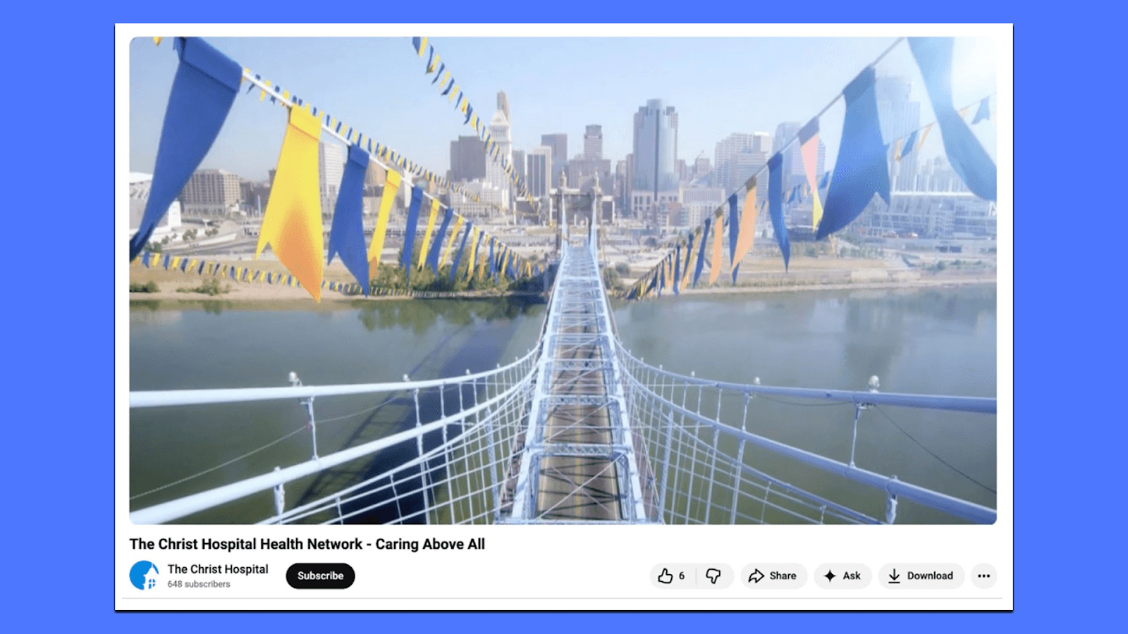
What works here is how the message shifts from where care happens to how care is delivered. The ad doesn’t list services or outcomes. It emphasizes the collaboration of physicians, staff, and systems working together. And positions healthcare as something that travels with the patient, not something patients must always travel to.
The visuals stay calm and expansive. By moving through urban and rural settings, the ad makes the network feel broad without being abstract. It’s easy to understand the point even without dialogue: this hospital system is present beyond its walls.
Takeaways for you:
Healthcare as a network, not a location. Showing connection across environments helps people understand scale and reach without needing explanation.
Visual metaphors can replace feature lists. The recurring strings communicate coordination and care more effectively than naming departments or services.
Airpost Helps You Get Winning Ads For Your Healthcare Brand Faster
Healthcare teams usually don’t struggle with intent. They know they need ads that are clear, trustworthy, and human. The harder part is creating enough variations to test different tones, formats, and explanations without turning every campaign into a long, expensive process.
That’s where many teams get stuck. One idea turns into one video. One video turns into one launch. And there’s very little room to learn what actually resonates with patients, caregivers, or everyday consumers.
Sounds familiar? That’s where Airpost comes in.
It’s built for teams that already have direction but need a better way to produce and test creative at scale. You bring your assets, your constraints, and your brief. Airpost helps you explore different angles, such as educational, reassuring, product-led, and lifestyle, without restarting from scratch every time.
Airpost combines AI with experienced creative strategists, so the output stays controlled and on-brief. You’re not prompting tools or sorting through noise. You’re reviewing options and deciding what to run.
Want more creative throughput, faster iteration, and fewer bottlenecks? Airpost gives you that path. Book a demo here to see how we can help.


