
Retail advertising is everywhere. From your phone screen to store windows to checkout counters. And because shoppers see so much of it, most retail ads get ignored without a second thought.
The retail ads that work tend to do a few things well. They make the product easy to understand. They feel familiar rather than forced. And they fit naturally into how people already shop, browse, or scroll.
Some rely on strong visuals. Others use simple, everyday language. A few focus on emotion or context instead of discounts and urgency. What they share is clarity. You know who the ad is for, what it’s offering, and why it matters, without having to think too hard.
In this article, we’re looking at retail ad examples that can help spark ideas for your own campaigns.
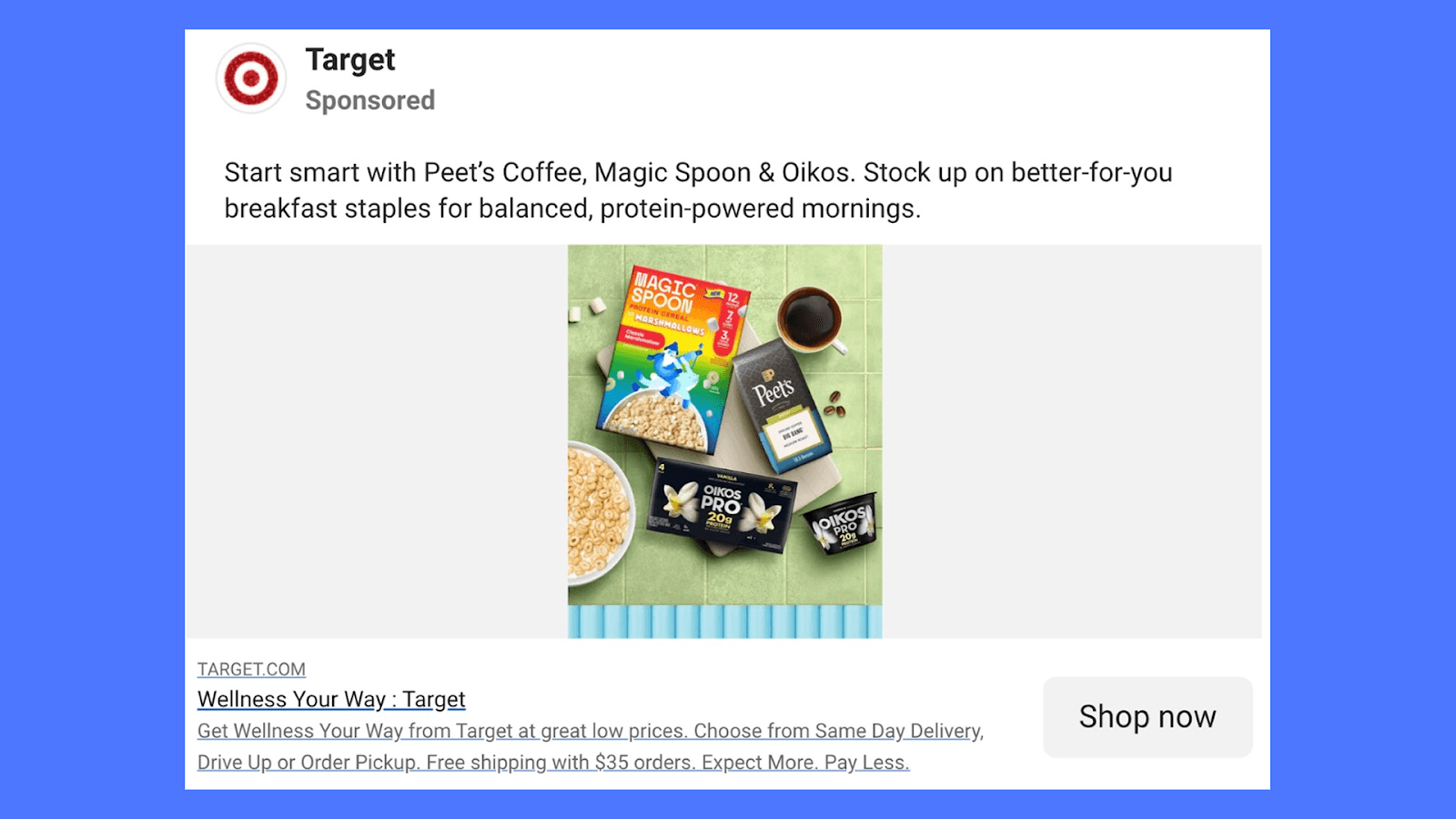
1. Target - Breakfast Wellness
This ad positions Target as the easy place to shop for “better-for-you” breakfast items. Instead of pushing one product, it curates a small set of familiar brands (Peet’s Coffee, Magic Spoon, and Oikos) and frames them as a smart way to start the day.
The copy names the situation (breakfast), suggests a benefit (better-for-you, protein-powered mornings), and then lists the brands. It doesn’t explain why each product is healthy or try to educate the shopper. That work is left to the packaging and brand familiarity.
The text gives just enough direction to frame the products, without trying to convince or overexplain. The focus stays on making the choice feel easy rather than “right.”
Takeaways for you:
Use a clear comparison when your audience already knows the alternative
Let visuals show everyday value instead of listing every feature
Keep subscription CTAs low-pressure and confidence-led
2. Walmart - Become a Member
This ad is promoting Walmart+ as a practical alternative to Amazon Prime. The message is straightforward: you get similar everyday benefits, but at a lower price. The line “$41 less than Prime” does most of the work. It’s clear, specific, and easy to understand in one glance.
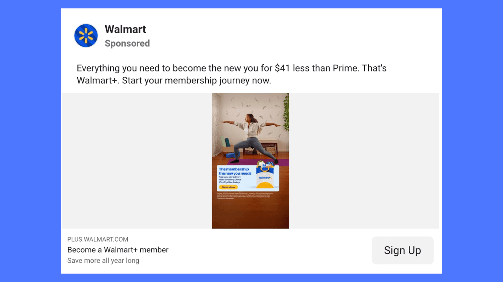
The visual keeps things grounded. Instead of showing products or store aisles, it shows someone working out at home. It subtly connects the membership to everyday life, like groceries, routines, and small upgrades, without spelling everything out. That fits Walmart’s broader positioning: useful, accessible, and for real life.
The copy doesn’t push too hard. It mentions the savings, highlights what the membership gives you, and then steps back. The CTA feels calm and optional rather than urgent, which makes sense for a subscription people already understand. Walmart isn’t trying to explain the category, but just why you should choose them.
Takeaways for you:
Use one clear price difference to make the choice obvious.
Don’t explain the membership in detail if people already know how it works.
Show the benefit in everyday life, not inside a store or app screen.
This is a good example of how retail ads can win on clarity and familiarity, not hype.
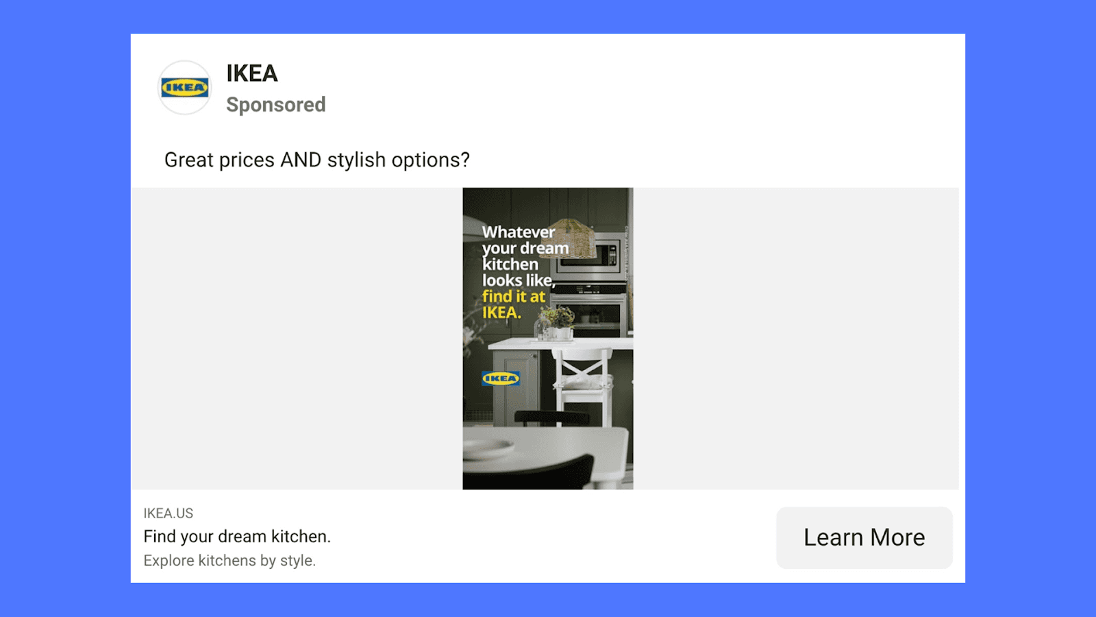
3. IKEA - Find Your Dream Kitchen
This ad captures a very familiar reaction: wait, you’re telling me it’s affordable, and it looks good? That’s exactly what the capitalized AND is doing. It mirrors the moment of surprise people have when they realize they don’t have to trade style for price.
Instead of overexplaining that idea, IKEA lets the kitchen do the talking. The space looks clean, modern, and realistic, like something you could actually build in your own home. The line inside the visual (“Whatever your dream kitchen looks like, find it at IKEA”) keeps things open-ended. It doesn’t push one look or one product. It reassures you that whatever your version of a dream kitchen is, IKEA probably has a way to get you there.
What works here:
The copy reflects how people naturally react, not how brands usually sell
The visual proves the claim without calling attention to price tags or specs
The ad focuses on possibility, not persuasion
Takeaways for you:
Use language people already say in their heads
Let one strong image carry the promise
When your value is “both,” don’t overjustify it, just show it
4. Bath & Body Works - Sensory Transition
This ad starts in a very ordinary moment: someone using a Bath & Body Works product as part of their routine. Then it quickly shifts into a different world: soft light, flowers filling the room, everything feeling calm and immersive. The switch is doing most of the work. It visually translates the idea of how the product makes you feel, not just what it smells like.
Instead of explaining notes or ingredients, the ad shows a before-and-after state. One second you’re in your day. Next, you’re somewhere more indulgent and pleasant. The line “Come back to your senses” fits that transition without needing much more copy. It’s not pushing urgency or discounts. It’s selling a mood.
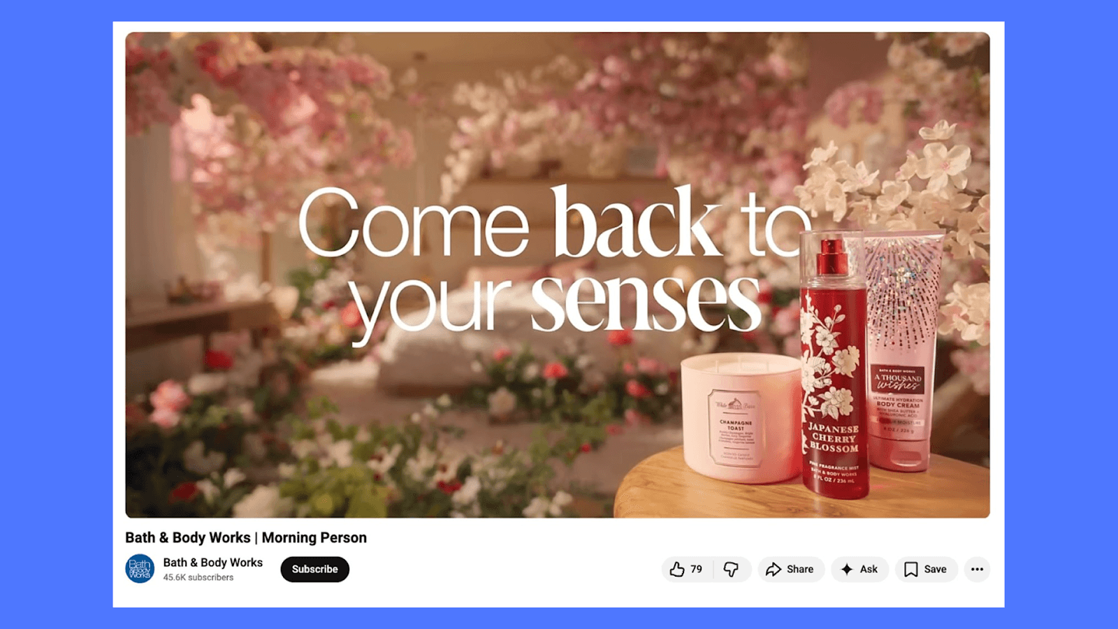
What’s useful here is how clearly the ad connects product use to an emotional outcome. The product remains present, but it doesn’t overpower the story. The focus stays on how the user feels once the product becomes part of their environment. For brands, this is a reminder that sometimes the strongest message isn’t said directly, it’s experienced through the shift you create on screen.
5. Sephora - Holiday Campaign
The ad is built around a single scene: a long table, people gathered together, unwrapping and reacting to products like they’re gifts. Everything looks playful and slightly over-the-top, almost like a holiday dinner mixed with a candy shop. The products are clearly present, but they’re part of the environment, not the center of attention. What stands out more is the energy; people interacting, laughing, passing things around.
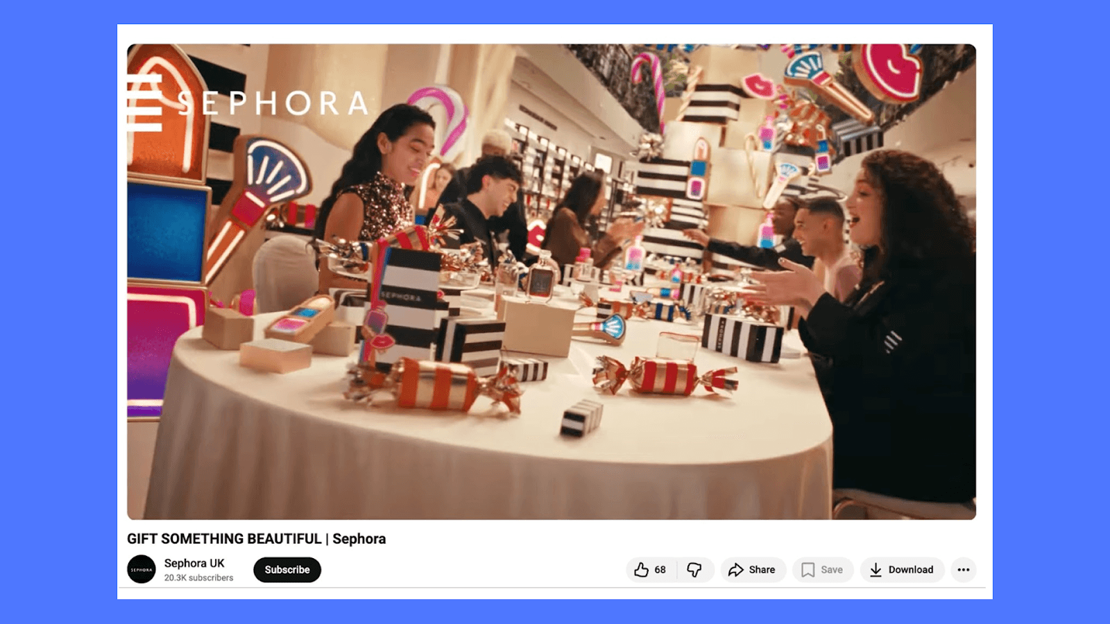
Sephora comes across less like a retailer here and more like a place where these moments happen. The ad isn’t trying to teach, compare, or persuade. It’s showing how the brand fits naturally into a social, celebratory setting, and letting that feeling do the work.
Takeaways for you:
You can sell a category by selling a moment, not a product.
Seasonal ads work better when they reflect how people feel during that time, not just what they’re buying.
Creating a world around your product can be more memorable than highlighting features or discounts.
Group scenes and shared experiences help the brand feel welcoming and inclusive, especially during gifting seasons.
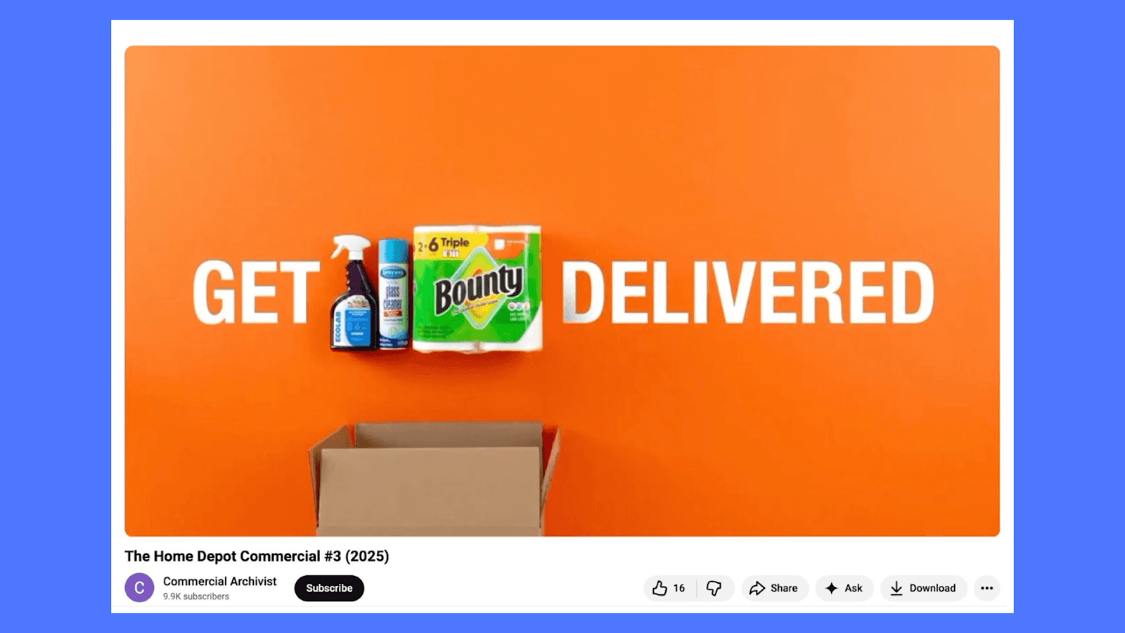
6. Home Depot - Get Delivered
This ad is about one clear idea: convenience.
You see everyday home essentials placed against a bright orange background, with a box opening underneath. Nothing fancy is happening. No people. No story. Just the products and the promise that they’ll show up at your door.
The visual does most of the work. The bold color instantly signals Home Depot, the items are familiar, and the composition makes it obvious what’s happening, even if you don’t read a word. It feels fast, practical, and very on-brand. This isn’t trying to inspire a lifestyle. It’s reminding you that getting what you need can be quick and easy.
Takeaways for you:
If the value is speed or convenience, show it visually instead of explaining it
Familiar products can be more effective than polished lifestyle shots
Simple layouts often work better for utility-driven purchases
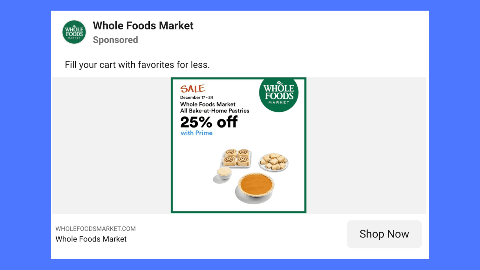
7. Whole Foods - Bake-at-Home Pastries
This ad is very direct. It’s about a specific offer, for a specific category, during a specific time window. You see the products clearly, the discount is easy to spot, and the brand is unmistakable. There’s no story to decode and no lifestyle scene to interpret. It’s built for someone who’s already in shopping mode.
The layout feels almost like an in-store sign, which works in its favor. White space keeps it readable, the food photography is simple, and the numbers do the talking. If you’re scrolling quickly, you still walk away knowing exactly what’s on sale and why it matters.
Takeaways for you:
Familiar product visuals work well for repeat or planned purchases
When the offer is strong, make it the center of the creative
Clear pricing and timelines reduce hesitation
Create High-Converting Retail Ads With Airpost
Retail teams don’t just need ideas. They need a steady flow of ads so they can keep testing what actually drives clicks and conversions.
Airpost is a hybrid creative platform that combines AI with experienced creative strategists to help brands produce 10-100+ ad variations per week. AI handles the heavy lifting. Humans shape the direction and quality.
Here’s what that looks like in practice:
You upload your brand assets (product shots, UGC, past ads, PDPs)
Airpost’s engine analyzes them and generates new video and static ads
Creative strategists guide angles, personas, and iterations
Winning ads get expanded into more variations automatically
Want help creating ads you can run and scale? Book a demo and let us show you how Airpost works in real campaigns.


