
SaaS is one of the most crowded categories in advertising. Most products solve real problems, but from the outside, many of them can look and sound the same. Similar promises, similar screenshots, similar claims about speed, scale, or AI.
That’s why good SaaS ads aren’t about being louder. They’re about finding a clear way to explain what the product actually does, who it’s for, and why it matters in a specific moment. The best ones don’t try to show everything at once. They pick a single idea, a familiar situation, or a real pain point, and build the ad around that.
In this post, we’ll look at 5 SaaS ad examples that cut through a noisy market and give you ideas to convert leads into customers.
1. ClickUp - Where Did the Day Go?
This ClickUp ad starts with a realization that feels uncomfortably familiar: the workday ends, but not because the work is done. Hours disappear, not into meaningful progress, but into updates, handoffs, searching for files, and fixing broken workflows.
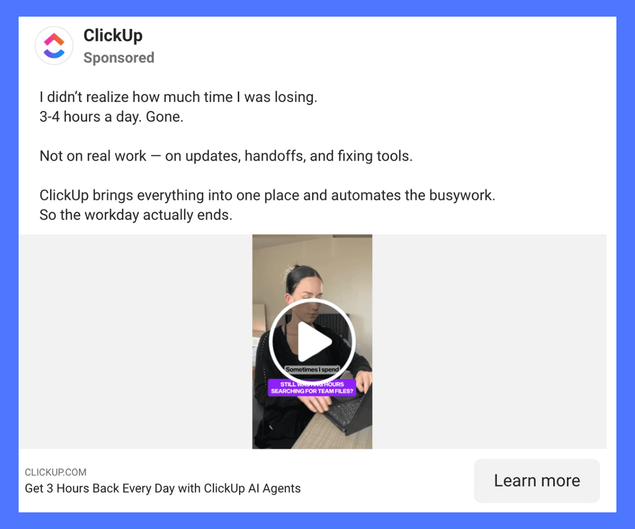
Instead of dramatizing team chaos, the ad keeps things grounded. One person. A laptop. A quiet acknowledgment that 3-4 hours a day are being lost to work around the work. The copy does most of the heavy lifting here. It clearly separates “real work” from the background noise that fills modern knowledge jobs.
ClickUp positions itself as the place where everything comes together. Not in an abstract, all-in-one-tools pitch, but in a very practical way: fewer updates, fewer handoffs, fewer systems to babysit. The promise is simple and human. The workday actually ends.
Takeaways for you:
Naming the invisible time drain helps people recognize themselves in the message.
Clear math (hours lost per day) makes the value feel concrete, not theoretical.
2. Ramp - Never Chase a Receipt Again
Ramp’s ad is built around a moment most finance teams know too well: the end of the month, when expense reports are overdue, and patience is already gone. Instead of explaining features upfront, the ad drops you straight into that tension. Quick cuts show someone awkwardly chasing coworkers for receipts, pinging them again and again, and getting nothing back except silence and mild irritation.
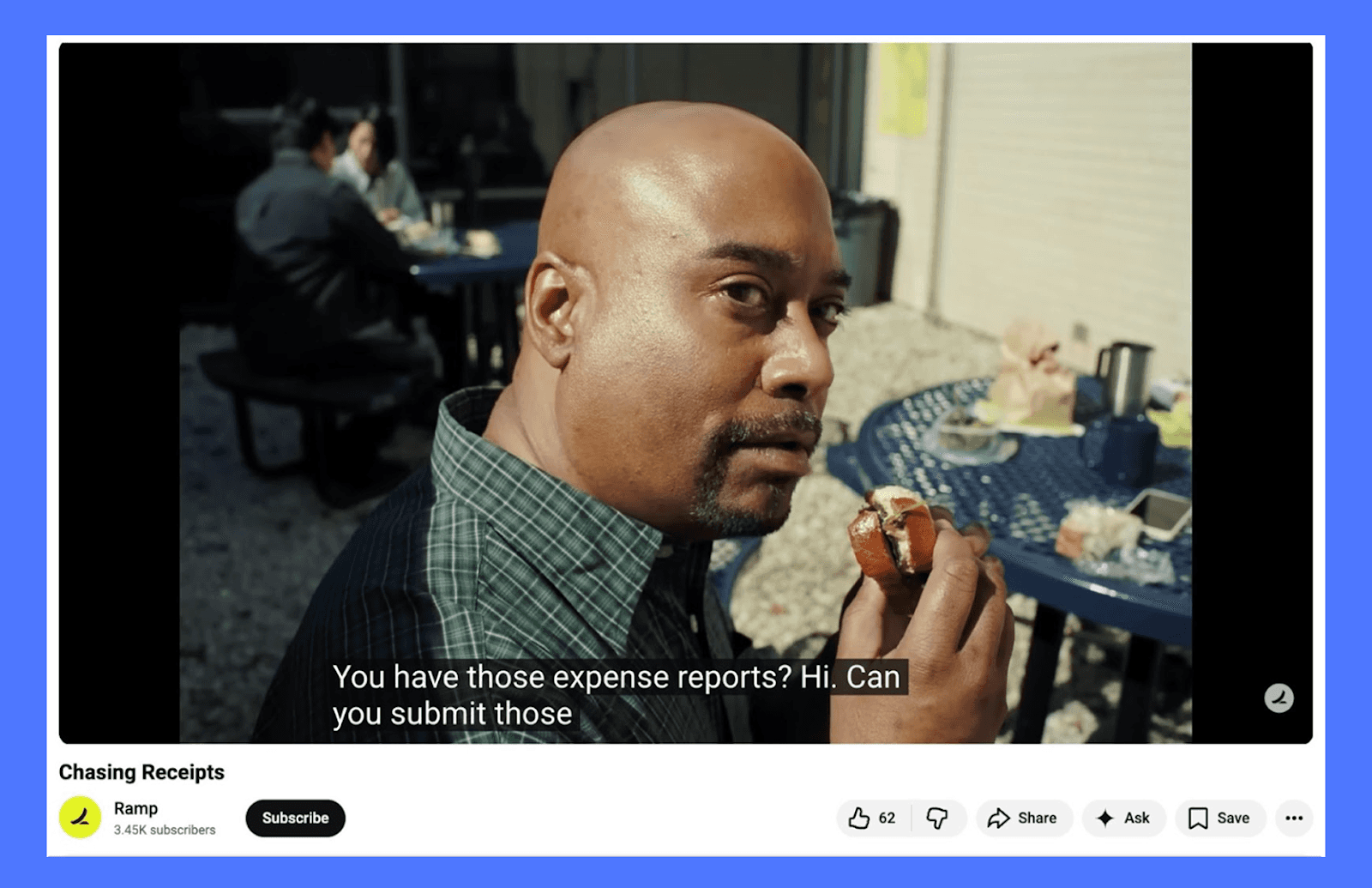
There’s no setup and no long explanation. If you’ve ever worked in finance, ops, or accounting, you recognize the situation instantly. The product promise lands only at the end: never chase a receipt again.
What works here is how specific the scenario is. Ramp isn’t trying to sell “better finance software” in the abstract. It’s selling relief from one very real, very annoying task that happens every single month. The humor stays subtle, rooted in reality rather than exaggeration.
Takeaways for you:
SaaS ads get stronger when they start with a familiar workflow problem, not a product overview.
You don’t need to explain everything the tool does. Solving one painful moment clearly can be enough to earn attention and trust.
3. Wise - Send Money the Smart Way
Wise sits in fintech, but the way it advertises feels very SaaS. The product itself is software-first, and the ad leans into that by explaining a problem that’s invisible until you see it clearly.
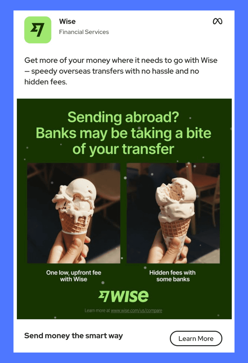
The idea is simple: when you send money abroad, banks quietly take a cut. Wise turns that abstract problem into something visual. One ice cream stays whole. The other slowly disappears. No dashboards, no feature list, no long explanation. You understand the value in a second.
What works well here is that the ad doesn’t overteach. It assumes the viewer already feels some friction with international transfers. Wise just gives language and imagery to that frustration, then positions itself as the cleaner alternative.
Takeaways for you:
Show loss, not savings. Instead of saying “we’re cheaper,” show what people lose when they don’t use your product
Keep the product in the background. The focus is the problem first, the solution second.
Try to explain a complex system without jargon. You can use visuals, metaphors, or words that are easy to understand; a single visual contrast.
For SaaS teams, the takeaway is clear: you don’t need to explain every feature. If your product removes the friction people already feel, show the friction plainly. Let the product be the obvious next step rather than the loudest voice in the ad.
4. Workvivo - HR Managers! Lighten the Load
This ad works because the idea is instantly clear before you read a single line of copy. The visual does most of the explaining. You see one person physically struggling to carry too many things at once, each labeled with a real HR responsibility: recruitment, payroll, performance, employee experience, wellbeing. It mirrors how HR roles actually feel: everything matters, and everything lands on the same person.
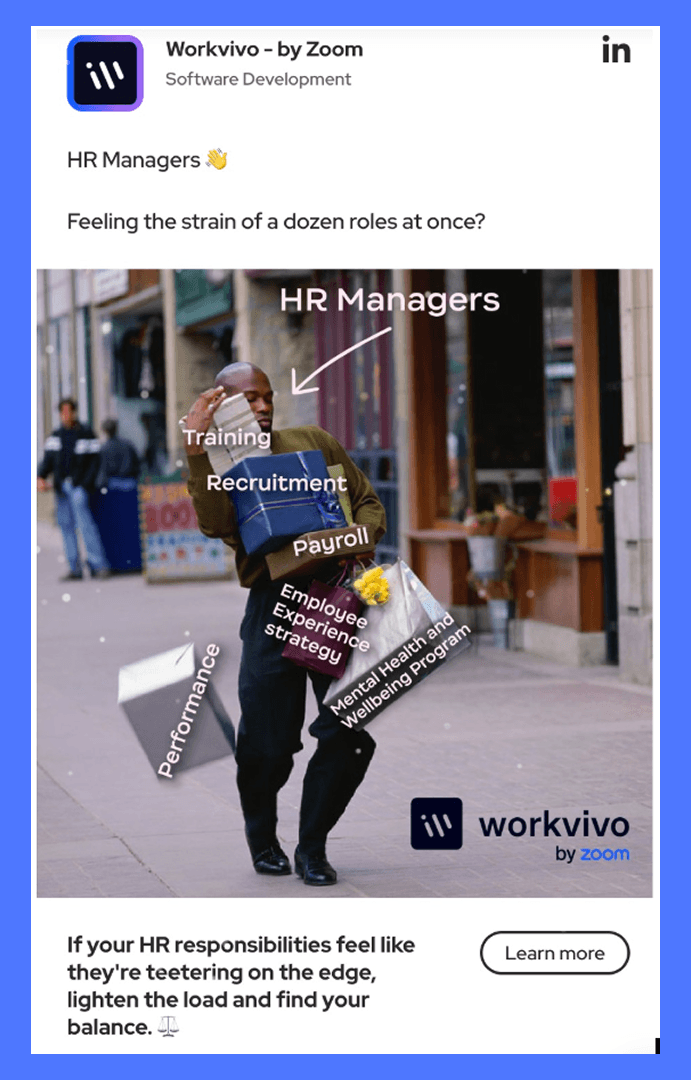
The copy simply supports what the image already communicates. It doesn’t introduce a new idea or over-explain the problem. Instead, it names the audience directly (HR Managers) and acknowledges the pressure they’re under. That alignment between the visual and the message makes the ad feel accurate rather than exaggerated.
Takeaways for you:
Use one visual that explains the problem without needing a copy.
Call out your audience directly so they know the ad is meant for them.
Position your product as reducing load, not magically fixing everything.
This is a good example of a SaaS ad where clarity comes from composition and framing, not clever wording. The viewer understands the problem in seconds, which is exactly what you want in a crowded feed.
5. Deel - Scale Globally Without Switching Tools
This ad leans into range rather than detail. The opening line immediately spans geographies (Argentina and the UK), so you understand the scope in one sentence. It’s not explaining global hiring; it’s normalizing it.
Visually, the globe and layered UI elements do a lot of the heavy lifting. You get a sense of scale without clutter. The product interface is present, but it’s not overwhelming, just enough to signal that Deel handles the operational side once the hiring decision is made.

The line “Hiring internationally shouldn’t feel like a second job” frames the problem in human terms. It’s not about compliance or paperwork upfront. It’s about effort and mental load. That makes the message accessible even to teams that aren’t deep into global expansion yet.
Takeaways for you:
Start with a specific, real scenario instead of a broad promise. It helps people understand the use case instantly.
Use concrete details (places, roles, numbers) to make abstract ideas feel real.
Lead with the outcome people want, not the process behind it.
This is a good example of a SaaS ad that sells ease of expansion rather than the mechanics behind it.
Create High-Converting SaaS Ads With Airpost
At this point, you’ve seen how strong SaaS ads start with a clear idea. A familiar moment. A small frustration. A simple visual that makes the point without over-explaining it.
The next step is putting your idea down on paper.
What’s the situation your customer instantly recognizes?
What’s the one thing your product removes, simplifies, or saves time on?
What does that look like as a short video, a static visual, or a quick hook?
Once an idea is on the table, it needs to turn into real ads: videos, statics, variations for different formats, and versions you can actually test across channels. That’s where having the right setup makes a big difference.
Airpost helps teams take ideas and turn them into ready-to-run ads. Whether you’re working on a video campaign or a set of static creatives, Airpost combines AI tools with experienced creative strategists to help produce multiple ad versions quickly, without changing how your team already works.
Book a demo and let us show you how to turn ideas into ads you can actually run.


